Responsive Ecommerce Themes
Optimize your shopping experience across smartphones, tablets and desktops
View themes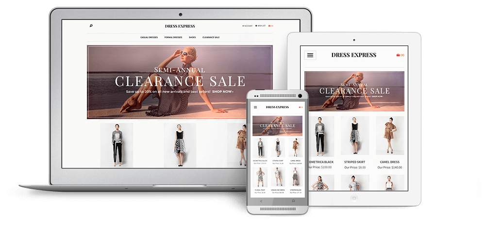
Here’s what responsive design means for you:
- Seamless customer experience across devices
- A helpful boost in SEO
- Simplified management of your site design
- Increased sales and conversions
Better for customers, better for sales
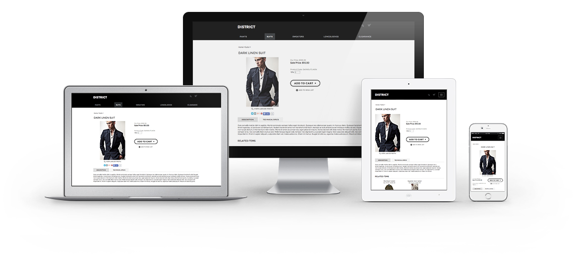
With simplified navigation and image-driven design, responsive themes transform your ecommerce site to look its best on any device. The seamless, fluid design of your site provides a better customer shopping experience, leading to a boost in sales and conversion rates.
Simplified site management
Instead of managing a mobile and desktop version of your site, responsive themes offer a single place for design management. This means when you make any updates to your HTML and CSS, it dynamically adapts on all versions of your site, including desktop, tablet and smartphones.
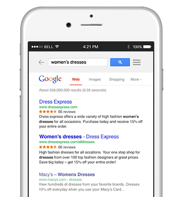
Automatic SEO advantages
A single URL for each page of your site builds authority and prevents duplicate content issues. In addition, search engines are known to rank websites with responsive design higher in mobile searches, meaning more traffic to your store.
See our responsive themes in action
View themes- What do you mean by “responsive design?”
All complexities aside, responsive design is an approach to web design that allows a website to optimally appear on a device, regardless of screen size. In other words, with responsive design, a website “responds” to a user’s environment, including device and screen size. Responsive design is proven to provide online shoppers with an improved user experience, which can lead to increased sales.
- What’s the difference between a site with responsive design and a mobile-optimized site?
A site with responsive design is configured to adjust to a user’s screen or window size, whereas a mobile-optimized site has a layout that is specific to mobile devices. Both include a user-friendly display of products, categories and the checkout page.
- How do I apply a responsive theme to my Volusion store?
To apply a responsive theme to your store, simply select the design of your choice within the template gallery of the Volusion admin and click the “Get It” or "Buy It" button to install. Then, go to the Saved Templates tab and click Activate to begin using your new responsive theme.
- Are the responsive themes free?
We have a number of free responsive designs for you to choose from and we’re working to continuously release new free and premium themes.
- Where can I learn more information?
To learn more about our responsive themes, particularly if you’re an existing Volusion storeowner, please check out our Knowledge Base.